16 December 2019
Katie Sixsmith
As a leading school website provider, we like to keep an eye on the latest design and development advances. This ensures that we can continue to offer creative and robust website solutions for our schools and trusts.
Fortunately for our customers, trends within the website design industry are not as frequently changing as those of its fashion counterpart. New ideas and ways of working are developed over time, with additional elements introduced; meaning that the trends we predicted last year are still as relevant today as they were twelve months ago.
To find out what's in store in 2020 for design and development, we spoke to Sophie, one of our senior designers, about her thoughts and predictions on the year ahead.
Mobile First Approach
We said it last year and we’ll say it again, responsiveness is key when it comes to website design and development. Now, more than ever, Google is prioritising and indexing mobile friendly websites first, and severely punishing those who do not have a responsive website - ranking them lower and scoring them less.
Here at e4education, a mobile first approach is at the forefront of every project we undertake. If you’re looking for a new website, this should be one of your key questions to any provider; if they say that it won’t be responsive on all screen sizes then we strongly urge you to look elsewhere.
Flexible Design Features
We know that schools need websites that are adaptable to their changing needs and requirements. A few years ago, it was common to see static content on a website that only changed to update new policies ready for inspection. However, with the rise in social media, millennials taking more of an active role in businesses and a societal change in how we view, receive and engage with information, websites - more than ever before - need to be adaptable, dynamic and relevant.
To help schools with this, we foresee a large rise in user driven content, with additional facilities added into the design to help engage parents and draw attention to key information throughout the year.
Website homepages need to be able to showcase upcoming events, important announcements and parental updates at the touch of a button.
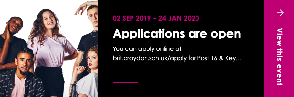
The Brit School in Croydon use a fly out on the bottom right of their slideshow to highlight upcoming events, such as admission application deadlines.
Alternatively, Holmer Green Senior School showcase important dates for the diary using a uniquely designed ‘ticket’ on the bottom left of their slideshow.
Emphasising USPs
As we mentioned in our USP Marketing Strategy white paper, identifying your Unique Selling Proposition (USP) is key to making your school or trust stand out from the crowd.
Your users need to know who you are, what you stand for and what makes you different as soon as they land on your homepage. They don’t want to go searching for the answers, they want you to make them easily accessible - so they can quickly determine whether your organisation is right for their child.
To do this, we anticipate a rise in designs that showcase the key elements of a school’s offering within the first few seconds of landing on the page - whether this is through values and strap lines emblazoned across the hero image or by USPs sharing equal billing at the top of the page alongside the slideshow.
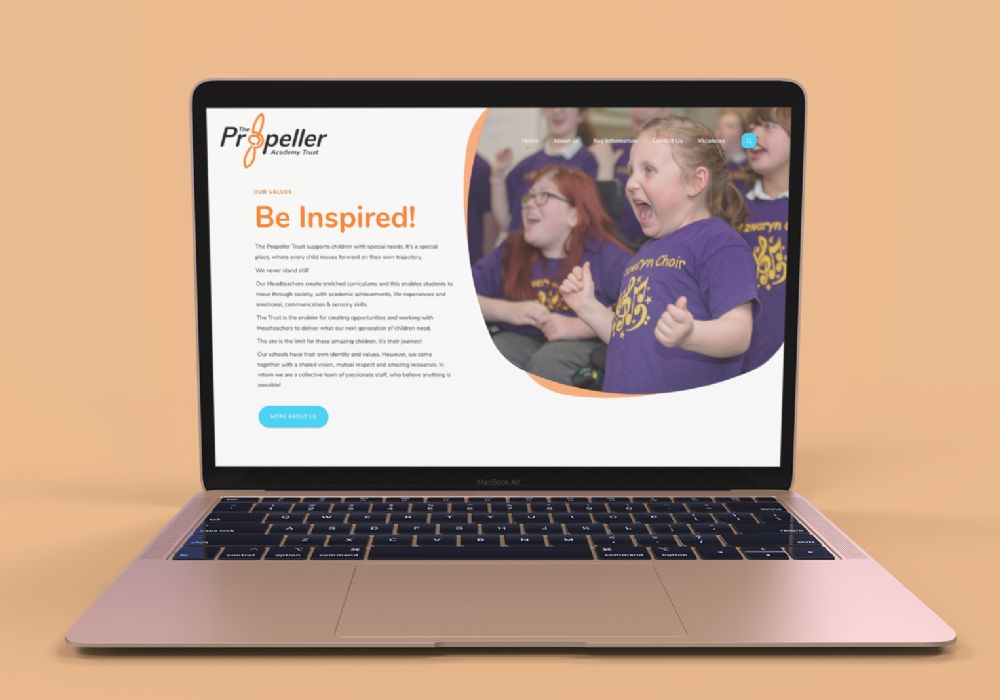
The Propeller Academy Trust is a perfect example of equal billing between text and imagery - launching directly into its core values as soon as you land and showing clear information about its schools and what makes it different, within seconds of scrolling down the homepage.
The Pilgrim’s School shows a different quality on each rotation of the slideshow ; all of these values add up to what it means ‘To Be A Pilgrim’.
The Fortis Trust emphasises its strapline ‘Strength in Partnership’ instantly - animating in as soon as the user lands on the page.
Creative Photography
Photography has always been an integral part of school website design - old adage states that ‘a photo is worth a thousand words’ and what better way to promote your offering than through professional photos depicting happy children enjoying themselves in school?
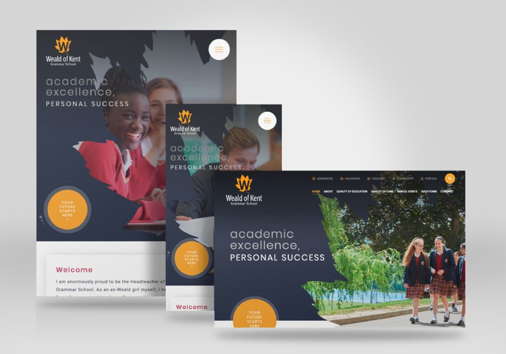
One of the latest trends incorporates custom designed backgrounds and cut-out imagery - taking website visuals to the next level.
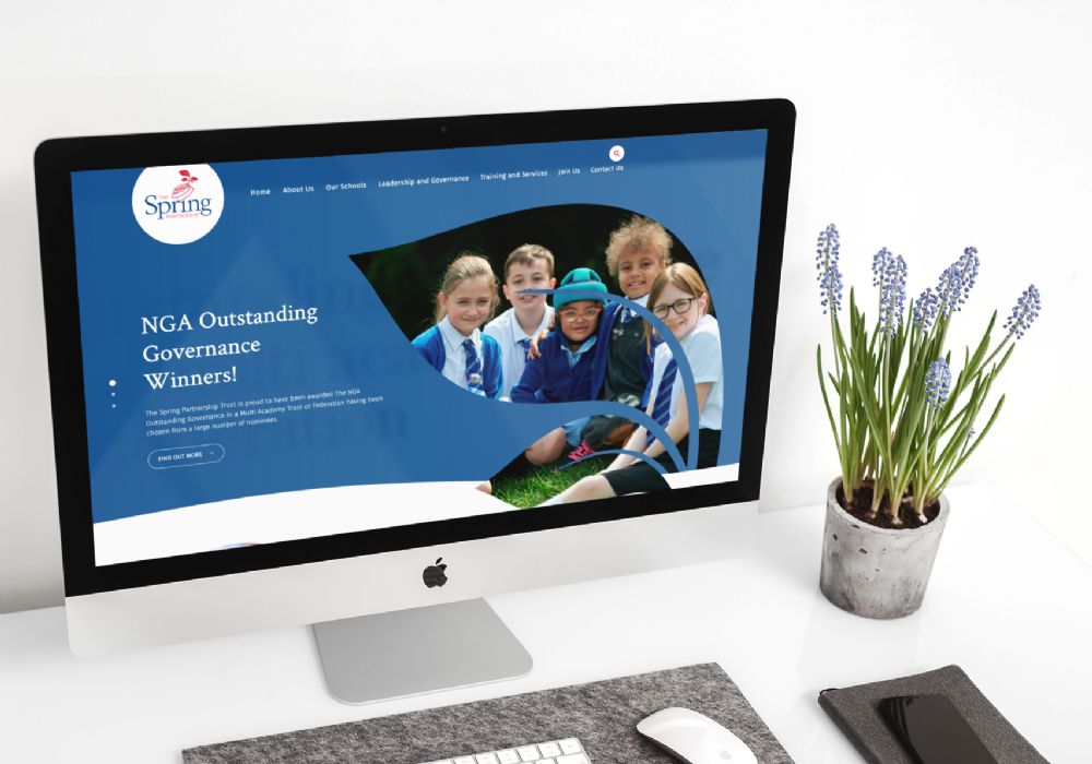
The Spring Partnership (above right) and Weald of Kent Grammar School are both great examples using the motif from their logos to create stunning homepage slideshows.
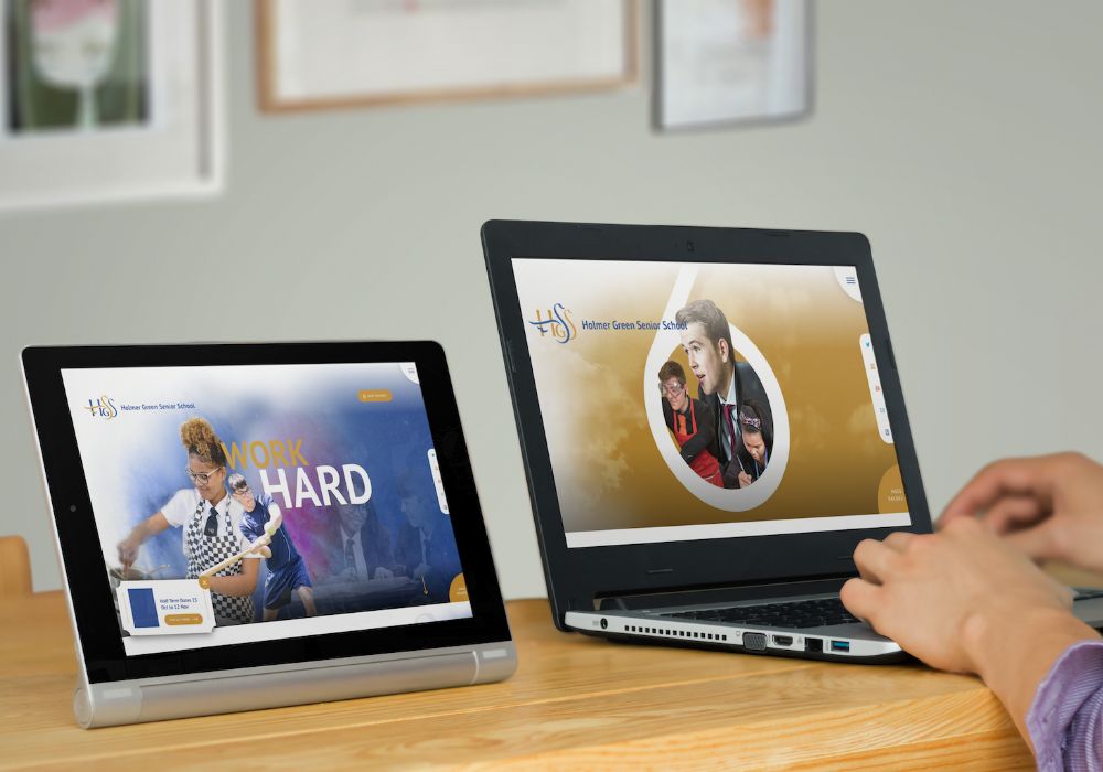
Holmer Green Senior School (above left) uses cut-out imagery and creative background visuals throughout the homepage to great effect, giving the whole website a magical feel.
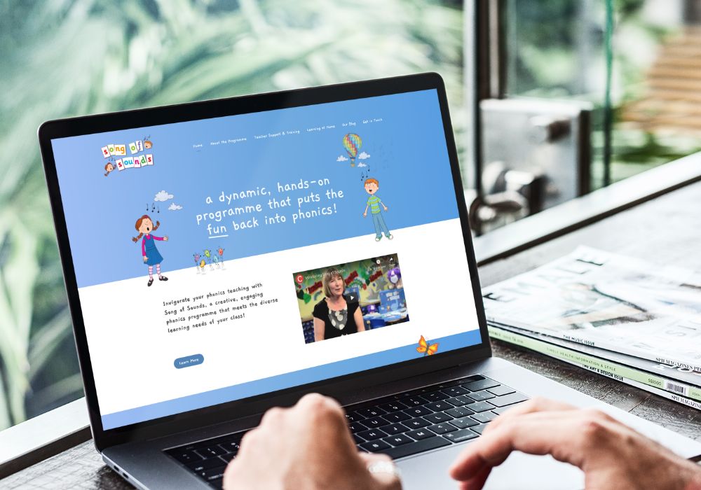
Interwoven Illustrations
Illustration has always been a popular design aesthetic, especially for websites aimed at, or related to, children.
The newest iteration of illustrated design takes on a more stylised, abstract approach with a push towards heavy textures and usage throughout the page - no longer are they isolated to the top of the page.
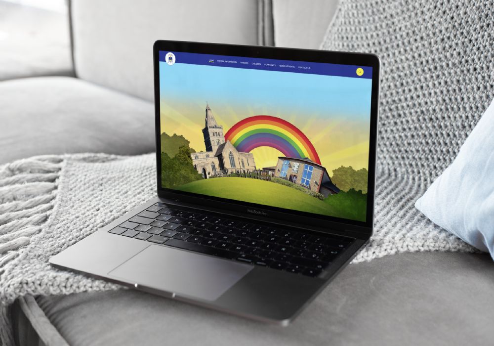
Castor School (left) incorporates modern elements with a heavier illustration style further down the page.
Song of Sounds (right) is a new take on the fully illustrated website, merging much loved child-friendly elements with contemporary content.
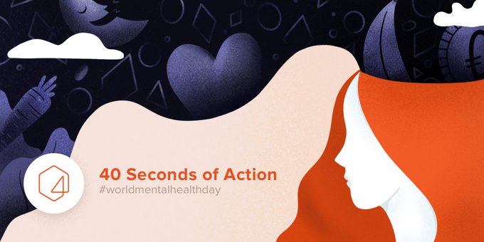
40 seconds of action campaign on World Mental Health Day:
Guiding The User
With the rise in mobile and tablet usage, we can safely say that ‘above-the-fold’ is trend firmly relegated to the past and the act of scrolling to view more of the design is definitely here to stay. Not only that, scrolling provides the perfect mechanism to control the delivery of your content and truly guide the user experience.
In 2020 we expect to see a lot more ‘guided’ design, using the homepage as an opportunity to take the user on a journey through your content, presenting them with the information you really want them to see and controlling their experience of it.
Moor House School's design draws the users' attention down the page - taking them on a journey through the school’s ethos, research and specialisations, leading to a call to action at the bottom. Also, take note of the abstract illustrations which appear as watermarks behind the main design!
Likewise, the lines on Stephen Perse also draw the eye down the page, this feature is then repeated within their inner pages, including on their interactive Diamond Model graphic.
Full Screen Menus
Website design trends are always evolving and circling back to the beginning. The burger menu is often a popular option for menu styling, especially when there are lots of top-level pages required.
Moving forwards, we expect to see burger menus evolve into full screen features that not only depict the expected navigation structure but also give the user more opportunities to access additional content, using them as a vehicle to highlight key areas of the website beyond the top level navigation.
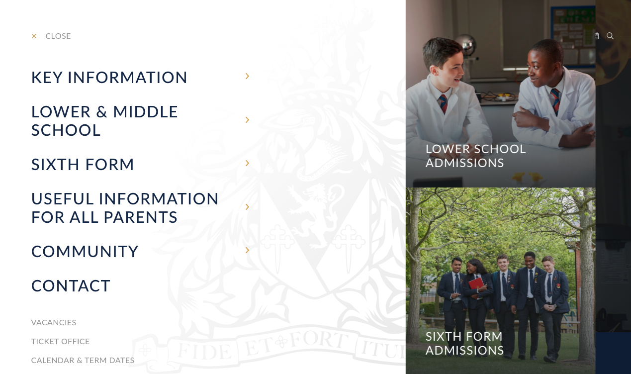
Westcliff High School for Boys and St Mark’s Academy are examples of how a full screen menu can work brilliantly - providing both additional navigation options and engaging design aesthetics through images and quick links.
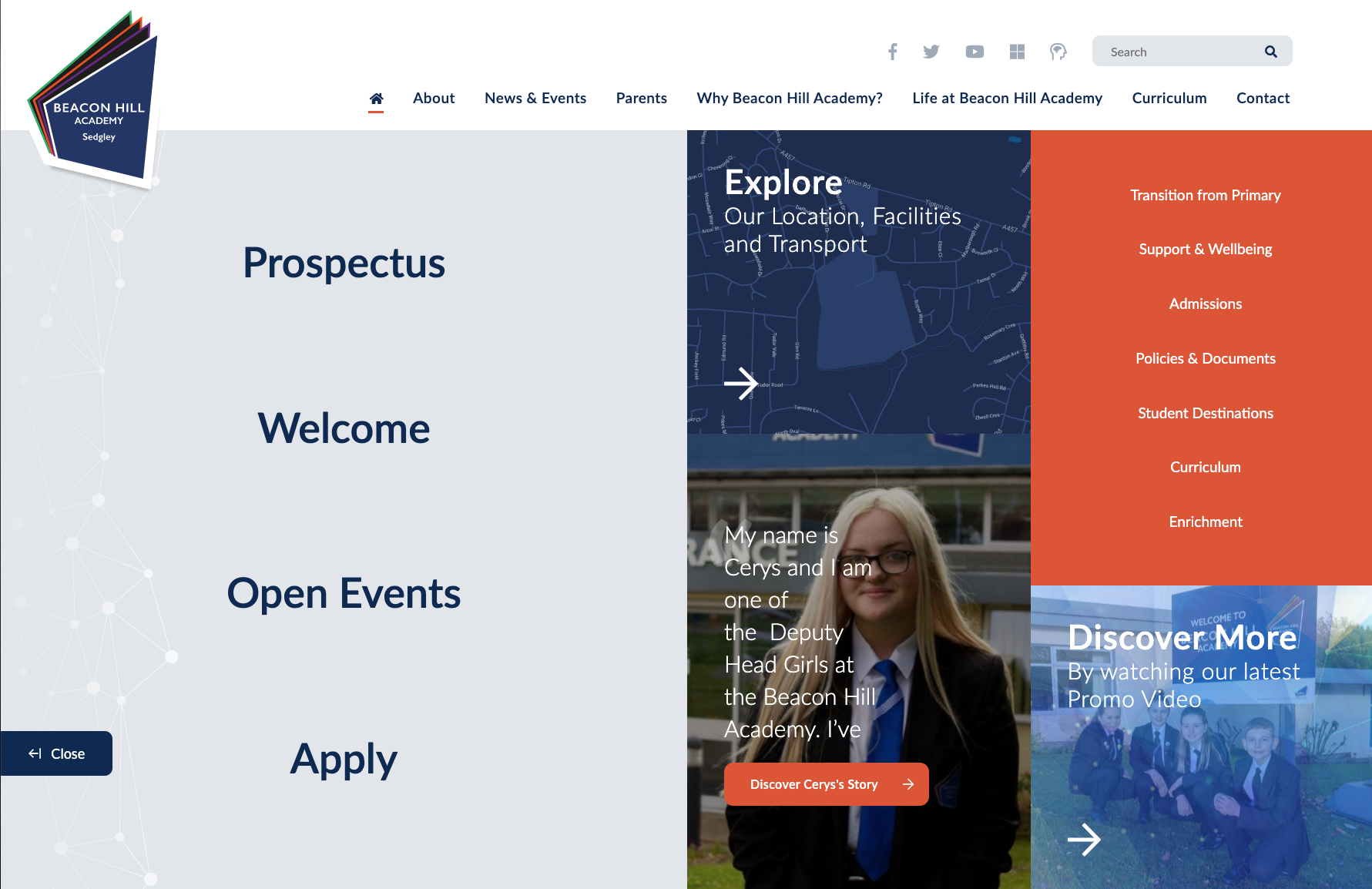
Beacon Hill Academy (and the other schools within the Dudley Academies Trust) use a full screen menu option in a unique way - alongside their traditional horizontal navigation bar. This can be accessed by the orange 'Discover' button at the bottom right of the slideshow and is tailored specifically to the needs and interests of prospective parents.
This additional option allows the schools to effectively showcase relevant content to both existing parents (traditional navigation) and prospective parents (full screen menu fly out) - providing both sets of users with an enriched experience.
Thinking Beyond The Homepage
No longer do innovative, bespoke design features have to be confined to the homepage of a website. The rise of custom inner pages has enriched the entire user experience - allowing us to think beyond the first impression offered by the homepage and helping to make the rest of the content just as useful and engaging.
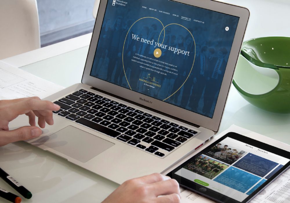
Princethorpe College chose to promote their alumni section and donations through feature-rich and dynamic custom landing pages.
Leicester High School wanted to emphasise their student stories, showing life at LHS through a series of custom designed, interactive case studies.
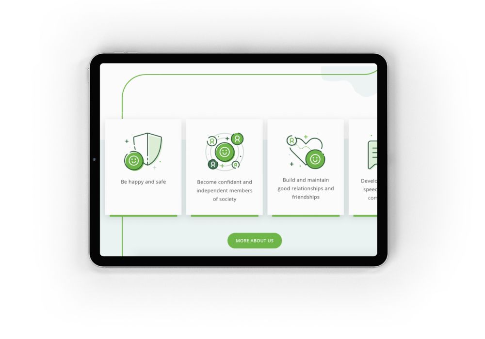
Visual Data
In 2020, we predict a rising design trend showcasing visual representations of data.
We know that statistics - whether they are about exam results, university destinations or numbers of students on pupil premium - can be of vital importance to inspectors and prospective parents but it can sometimes be a challenge to display them in an easy-to-read, user-friendly manner.
The use of graphical representations can help to make this information both accessible and interesting.
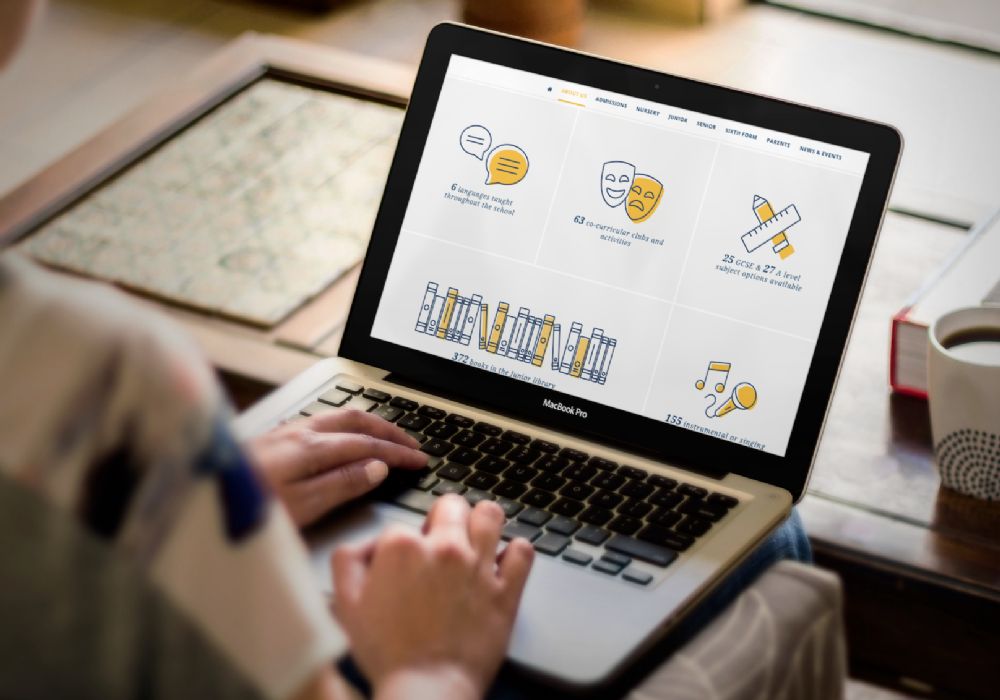
The design of St Gabriel's in Numbers shows the school's key statistics off perfectly.
Colour of the Year
To wrap things up, Pantone® have released their colour of the year for 2020. This year, they have chosen Classic Blue - ‘instilling calm, confidence and connection - this enduring blue hue highlights our desire for a dependable and stable foundation on which to build as we cross the threshold into a new era’.
As with all Pantone colours, we predict that we’ll be seeing a lot more of Classic Blue across all areas of design - from fashion and furniture to websites and branding. Let us know if you see any school websites in this shade, as we progress through the rest of the academic year!
References:
- Websites
- Top Tips
- Product Updates
You might also like...
New year, new start
A new year (calendar or academic) is the chance for a fresh start. Goals are set, mistakes are relegated to the past and there’s generally a feeling of ‘newness’ in the air. Whether you’re looking for a new school website design, wanting to improve your school newsletter f...
DfE Compliance: Displaying your curriculum on your school website
Your school website is key source of information for parents, students, staff and the community, but there is certain content that you must always have visible on your website, and which will be checked by Ofsted inspectors prior to a visit. We have a full guide to all of these requirements which...